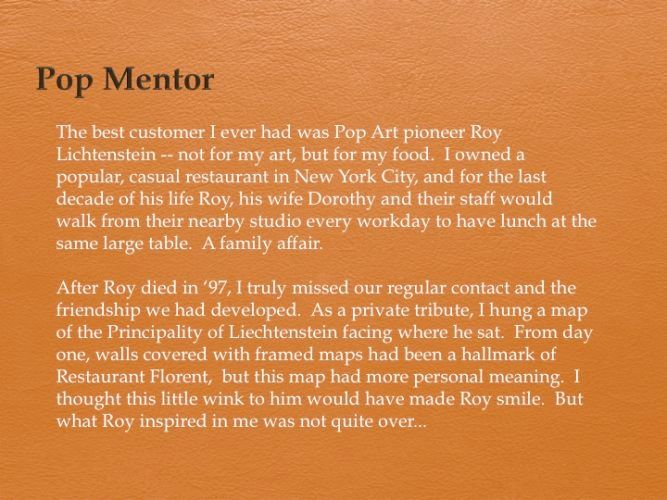
-
-
")
Liechtenstein #4 - Untouched
Dorothy understood why this piece was hanging there. One day just before I closed the restaurant in 2009, she told me that she wanted to buy that little picture. “As a matter of fact,” I told her, “All of the maps hanging here are up for bid on e-Bay to create a ‘Bon Voyage & Thank You’ fund for my staff.” She seemed truly touched by that sentiment. A week later, she slipped a folded check into my hand and asked, “Is this enough?” Let me say that it was a very generous amount. Now, I was the one a little teary-eyed. Right there, I decided I was going to create a piece for her, interfering on the same map of Liechtenstein, which fortunately, I had made several copies of. (text continues with next image)
-
 #09006(continued from previous slide) My idea was to alter the country. I wasn’t sure quite how, except I would populate it, make it grow. I started building on Vaduz, the capital. Then, on villages. Then, I made new villages in the valleys and up mountain slopes, the way places do rationally grow. A sensible, correct evolution -- until my manic obsessive nature took control. Now, towns were popping up on the very tops of mountains, where no sane person would build a house. What had I done to my well-intentioned gift? Or to my art? It demanded an exit strategy of aesthetic proportions! What if my mandate of “Graphic Obliteration” became its glue, its cohesion, its raison d’être? I would cover all text with buildings -- except, of course, for the name Liechtenstein. I did it, I loved it...but would Dorothy? (text continues with next image)")
Liechtenstein #1
2009 (Black ink on enlarged Carte Michelin of the Principality of Liechtenstein/8 X 10in) #09006(continued from previous slide) My idea was to alter the country. I wasn’t sure quite how, except I would populate it, make it grow. I started building on Vaduz, the capital. Then, on villages. Then, I made new villages in the valleys and up mountain slopes, the way places do rationally grow. A sensible, correct evolution -- until my manic obsessive nature took control. Now, towns were popping up on the very tops of mountains, where no sane person would build a house. What had I done to my well-intentioned gift? Or to my art? It demanded an exit strategy of aesthetic proportions! What if my mandate of “Graphic Obliteration” became its glue, its cohesion, its raison d’être? I would cover all text with buildings -- except, of course, for the name Liechtenstein. I did it, I loved it...but would Dorothy? (text continues with next image)
-
 #09007(continued from previous slide) As I had two more copies of the map, I could now do another more controlled, more focused piece for Dorothy. My flight of fancy with the first was a much more whimsical approach than I had ever allowed myself -- constraints of logic, be damned. In fact, the first had been so liberating an experience and I had spent so much time on it, I now wanted to keep it for myself. So I calmly began again, until the same crazed compulsive character took possession. This one became as out of control as the first -- and as much fun. Still, there had to be a way to thank Dorothy... (text continues with next image)")
Liechtenstein #2
2009 (Black ink on enlarged Carte Michelin of the Principality of Liechtenstein/8 X 10in) #09007(continued from previous slide) As I had two more copies of the map, I could now do another more controlled, more focused piece for Dorothy. My flight of fancy with the first was a much more whimsical approach than I had ever allowed myself -- constraints of logic, be damned. In fact, the first had been so liberating an experience and I had spent so much time on it, I now wanted to keep it for myself. So I calmly began again, until the same crazed compulsive character took possession. This one became as out of control as the first -- and as much fun. Still, there had to be a way to thank Dorothy... (text continues with next image)
-
 #09008(continued from previous slide) I would do a THIRD map of Liechtenstein. And I could display all three at a quickly approaching show. Then Dorothy could choose the one she liked best. This time I would not work directly on the map, but on a piece of translucent vellum over it. A blank piece of paper, free of any existing development, graphics or history. I could create my own Liechtenstein -- as long as I was true to the geography and to urbanistic logic. It began with three warring medieval cities built on three of the terrain’s hilltops. I drew on into the Renaissance, where they became wealthy from trade, and so each developed a lower town nearer to the Rhine. I kept drawing. One day left until the show. I entered the 18th and 19th Centuries. The cities blended into each other. Four A.M. I reached the 20th Century, and the single city’s suburbs stretched into the outlying valleys. Six A.M. The 21st Century country by now had em")
Liechtenstein #3
2009 (Black ink on vellum/8 X 10in) #09008(continued from previous slide) I would do a THIRD map of Liechtenstein. And I could display all three at a quickly approaching show. Then Dorothy could choose the one she liked best. This time I would not work directly on the map, but on a piece of translucent vellum over it. A blank piece of paper, free of any existing development, graphics or history. I could create my own Liechtenstein -- as long as I was true to the geography and to urbanistic logic. It began with three warring medieval cities built on three of the terrain’s hilltops. I drew on into the Renaissance, where they became wealthy from trade, and so each developed a lower town nearer to the Rhine. I kept drawing. One day left until the show. I entered the 18th and 19th Centuries. The cities blended into each other. Four A.M. I reached the 20th Century, and the single city’s suburbs stretched into the outlying valleys. Six A.M. The 21st Century country by now had em
-
 The group show was called “The Map as Art.” Christopher Henry, the gallery owner, suggested that we hang the original map from the restaurant on top. The other three would be seen flowing downward and evolving out of it. The wonderful surprise for me was that hanging together, with the repetition and the absurdity of the habitation, it WAS Pop. And Dorothy responded to something -- perhaps my freer, more eccentric style; perhaps having seen the original one in that spot for several years... Whatever it was, she loved them together and wanted to own the whole thing, which now hangs exactly the same way in the Lichtenstein Foundation Gallery. The series started as a single, simple personal gesture and a play-on-words that got carried further and further into the abstract. My Pop mentor took me far beyond what I expected to an eccentric and freer style, with less relationship to reality. It was a place I got to abandon urbanistic principles for my ow")
Photograph of "Liechtenstein" series, as exhibitied at Christopher Henry Gallery, New York. April 2010
(continued from previous slide) The group show was called “The Map as Art.” Christopher Henry, the gallery owner, suggested that we hang the original map from the restaurant on top. The other three would be seen flowing downward and evolving out of it. The wonderful surprise for me was that hanging together, with the repetition and the absurdity of the habitation, it WAS Pop. And Dorothy responded to something -- perhaps my freer, more eccentric style; perhaps having seen the original one in that spot for several years... Whatever it was, she loved them together and wanted to own the whole thing, which now hangs exactly the same way in the Lichtenstein Foundation Gallery. The series started as a single, simple personal gesture and a play-on-words that got carried further and further into the abstract. My Pop mentor took me far beyond what I expected to an eccentric and freer style, with less relationship to reality. It was a place I got to abandon urbanistic principles for my ow